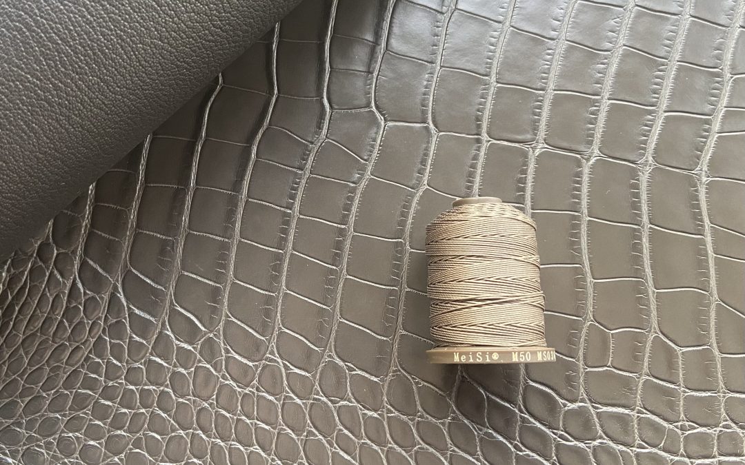
Many of you, my fellow tanners, have probably faced the dilemma of choosing a thread colour for your new project. It seems that such an insignificant element as thread colour can dramatically change the perception of the finished product, turning a good piece into a work of art or, on the contrary, ruining even the most painstaking work. Let’s understand together what nuances should be taken into account when choosing thread colour to make your leather goods always look perfect.
Why is it so important?
At first glance, the choice of thread may seem like a trifle. But trust my experience, a poorly chosen colour can ruin even the most painstaking work. Thread is not only a means of joining parts, but also an important element of design, which can emphasise the beauty of the product, add sophistication to it or, on the contrary, make it mediocre.
My methods of colour matching:
Over the years of practice, I have developed a few basic methods of thread colour matching:
- The ‘tone-on-tone’ method: This is the simplest and most reliable. It consists of choosing a thread that is as close as possible to the colour of the leather you are using. This method is ideal for classic, elegant pieces where restraint and nobility are important, where the emphasis is on the texture and quality of the leather itself. To achieve the best possible match, I recommend using catalogues or samples of threads, leathers and other materials used.
- Contrast Method: This method allows you to create a striking and memorable effect. Here we use threads, the colour of which is sharply different from the colour of the leather. For example, for dark brown skin, beige or cream coloured threads are perfect, and for black skin, red or white threads are perfect. For fair skin, you can use dark brown or black threads. It is important to remember that the contrast should be moderate and harmonious. Too much contrast can distract attention from the skin itself.
- Shade-to-Shade Method: This method involves using threads that are a few tones lighter or darker than the base colour of the skin. It can create an interesting effect of depth and volume, adding visual complexity and sophistication to the piece.
- Using the colour wheel: The colour wheel is an indispensable tool for any designer, including the tanner. It helps you understand which colours go together and which do not.
The colour wheel and its application in leatherworking:
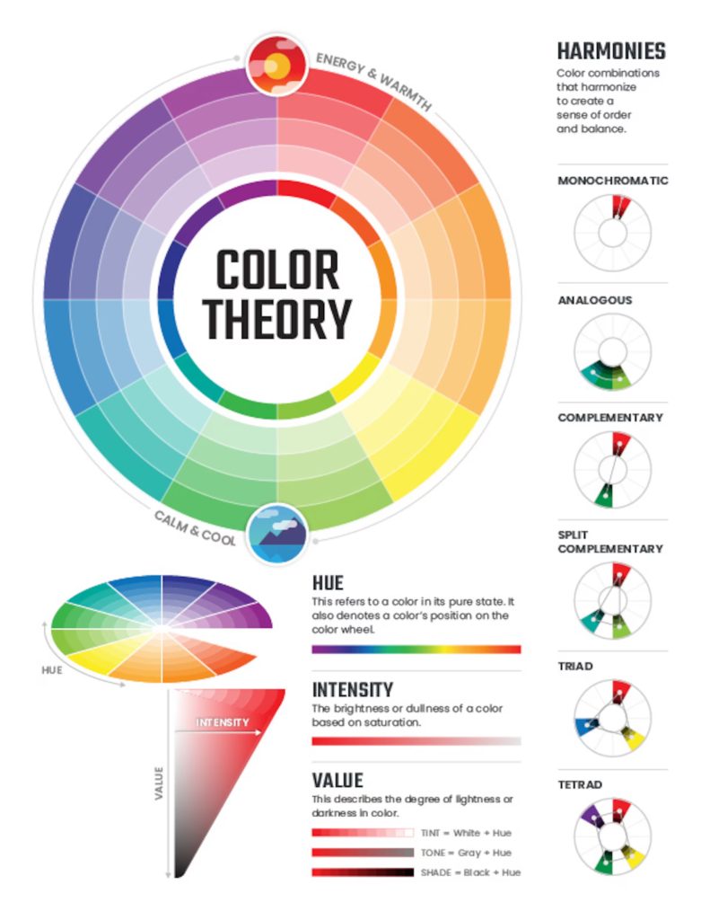
The colour wheel is a versatile tool that helps us to understand how colours interact with each other.
The central element, on which all the primary colours are represented, is divided into sectors, each corresponding to a specific colour. The image illustrates different ways of combining colours to create harmonious compositions: monochromatic, analogue, complimentary, separate-complementary, triadic and tetrad.
Basic characteristics of colour:
Hue: The pure colour in its original form.
Intensity: The brightness or dullness of a colour.
Value: The degree of lightness or darkness of a colour.
Let’s look at 7 basic colour schemes that are often used in design. Each of them creates a unique visual effect and conveys a specific mood.
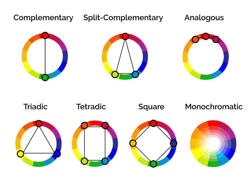
Complementary: A combination of two colours on opposite sides of the colour wheel (e.g. red and green, blue and orange). Effect: Creates a high contrast, attracts attention and makes an image more vivid and memorable. Often used to create accents. In leatherwork, for example, a combination of dark brown leather and turquoise thread can be used to create a bright and unusual accessory.
Split-Complementary: A variation of the complementary scheme. Two adjacent colours are used instead of one complementary colour. Effect: Less contrasty than complementary, but still creates an interesting interplay of colours. For example, threads of blue-green and purple shades can be matched with brown skin.
Analogous: A combination of three colours next to each other on the colour wheel (e.g. red, orange, yellow). Effect: Creates a harmonious and calm impression. Often used in nature and interior design. In tanning, it can be shades of brown, beige and ochre.
Triad: A combination of three colours equidistant from each other on the colour wheel, forming an equilateral triangle. Effect: Creates a bright and dynamic impression. It is often used in children’s design and to attract attention. A combination of red, yellow and blue, for example, can be used in this way.
Tetradic: A combination of four colours equally spaced on a colour wheel forming a rectangle or square. Effect: Creates a bright and contrasting effect, but requires more careful balance to avoid visual chaos.
Square: A special case of the tetrad scheme, where the four colours are equidistant from each other and form a square. The effect is similar to the tetrad scheme, but the equal distance between the colours results in greater harmony and balance.
Monochromatic: The use of different shades of the same colour. Effect: Creates an elegant and sophisticated look by emphasising shape and texture. For example, using threads from light beige to dark brown for a brown coloured leather product.
Important to remember: The choice of colour scheme depends on the specific task and the desired effect.
The psychology of colour: How colour affects perception and mood
Colour plays a huge role in our lives, influencing our emotions, moods and even behaviour. In the context of leather crafting, choosing a thread colour is not only a matter of aesthetics, but also a way to convey a certain message and evoke certain associations in the customer. Understanding the psychology of colour can help you create products that are not only beautiful, but also emotionally appealing.
Let’s take a look at how primary colours can influence perception:
Red: This colour is associated with energy, passion, strength, action and courage. It can evoke strong emotions, both positive (love, passion) and negative (anger, aggression). In leatherwork, red thread colour can be used to create bright accents that emphasise the dynamic and bold character of the product. However, it is worth using it moderately so as not to overload the image.
Orange: The colour of optimism, joy, creativity and enthusiasm. It is less aggressive than red, but still quite energetic. Orange thread colour can give a cheerful and relaxed look to a piece.
Yellow: The colour of sunshine, light, intelligence and optimism. It is associated with joy, happiness and positivity. Yellow thread colour can add lightness and freshness to a piece.
Green: The colour of nature, harmony, growth and renewal. It is calming and creates a sense of balance and stability. Green thread colour can be used to create eco or rustic products, emphasising their naturalness and closeness to nature.
Blue: The colour of calmness, reliability, trust and intelligence. It is associated with depth, wisdom and stability. Blue thread colour can give a product an understated and elegant look. It is often used in classic and business accessories.
Purple: The colour of luxury, sophistication, mysticism and creativity. It is associated with wisdom, spirituality and independence. Purple thread colour can add mystery and sophistication to a piece.
Brown: The colour of earth, stability, reliability and comfort. It is associated with tradition, comfort and naturalness. Brown thread colour is a classic choice for leather goods, emphasising their strength and durability.
Black: The colour of elegance, strength, power and mystery. It is associated with formality, restraint and sophistication. Black thread colour is a universal choice, suitable for most leather goods.
Practical tips:
- Consider the thickness: Thicker and stronger threads are better for thick and coarse leathers (coffers, saddles,…) and thinner threads for thin and delicate leathers (watch straps, bracelets, clothing,…). The thickness of the thread also affects the appearance of the seam: a thicker thread will create a more pronounced seam. A thread that is too thin on thick leather may tear, and a thread that is too thick on thin leather may look rough.
- Pay attention to the texture of the thread (weave/twist): Twisted threads look more elegant and suitable for classic pieces, while braided threads look more rough and archaic, which goes well with a rustic or vintage style.
- Consider the finish of the leather: The matte or glossy finish of the leather can also influence the perception of the thread’s colour. The thread itself also has differences. Synthetic threads tend to be shiny, while threads made of natural fibres (nettle, linen) have a natural look without shine.
- Test the thread on a small sample of leather: Before stitching the entire piece, be sure to test the thread on a small piece of leather. This will avoid mistakes and disappointment.
- Evaluate the colour of the thread in different light: The colour of the thread can look different in daylight and artificial light. Therefore, it is important to evaluate the chosen shade under different conditions to avoid unpleasant surprises.
- Consider the style of the product: For classic products, it is better to choose neutral shades of thread (black, brown, beige, grey), which will not distract attention from the shape and material. For modern and more daring products, bright and contrasting colours can be used to emphasise their originality.
Trends in colour combinations:
In the world of fashion and design, colour trends are constantly changing, reflecting the zeitgeist and the mood of society. Keeping up with these trends is also important for leatherworkers, as the colour of the thread is an important detail that can make a product look current and stylish.
The Pantone Colour Institute, the world’s acknowledged authority on colour, annually selects the colour of the year that reflects global trends in various fields, from fashion and interior design to graphics and art. This colour becomes a kind of symbol of the year, reflecting the mood and expectations of society.
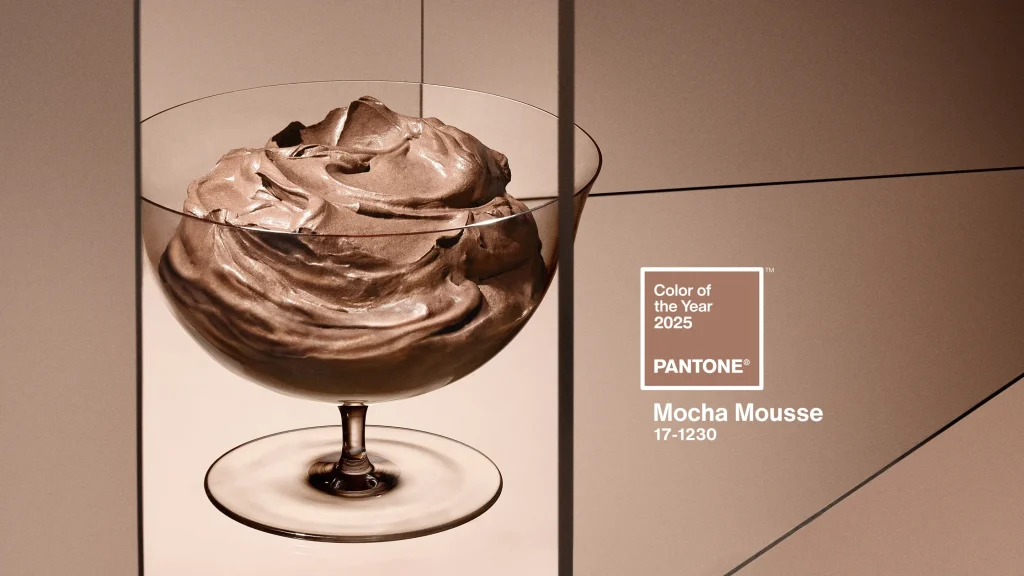
For 2025, the Pantone Colour Institute has chosen PANTONE 17-1230 Mocha Mousse, a warm, rich brown shade reminiscent of the colour of chocolate mousse or strong coffee. This colour radiates warmth, cosiness and comfort, evoking associations with home and pleasant moments
Application of Mocha Mousse in leatherworking:
Mocha Mousse is a versatile and noble shade that goes well with different leather colours and textures. Here are some ideas on how you can use this colour in your products:
Monochrome combinations: Using Mocha Mousse yarns of different saturations will create an elegant and understated look. For example, for a cognac-coloured leather piece, you can use a lighter or darker thread to create a gradient effect.
Combinations with neutral colours: Mocha Mousse works well with beige, cream, grey and white. These combinations create a calm and balanced look, emphasising the quality of the leather and the craftsmanship.
Contrasting combinations: Mocha Mousse can be used in combination with lighter or brighter colours such as ivory, peach or muted orange to create a more striking and memorable effect. It is important to strike a balance so that the contrast is not too stark.
Combinations with pastel colours: Mocha Mousse also works well with pastel colours such as lavender, mint or soft pink. These combinations create a delicate and romantic look.
Other trends:
In addition to Pantone’s colour of the year, other current trends in colour combinations are worth noting:
- Natural and earthy tones: Natural shades inspired by nature remain on trend: various shades of brown, green, beige, ochre. These colours create a feeling of cosiness, warmth and connection with nature.
- Combinations with metallic shades: Gold, silver, bronze and copper – these shades can add luxury and sophistication to a product. When combined with leather, they create an interesting contrast of textures.
- Bright accents: Despite the trend towards naturalness, bright accents are still relevant. Small details in bright colours can liven up a look and give it personality.
Following trends is an important aspect, but don’t forget about your own style and vision. Experiment, look for new combinations and create unique pieces that will delight you and your customers.
Brief summary:
Choosing a thread colour for a leather product is an important step that affects the overall impression of the finished work. There are several key factors to consider when making your choice:
Selection methods: There are various methods such as tone-on-tone, contrast, shade-on-shade and using the colour wheel. Each method achieves a specific visual effect.
Psychology of colour: The colour of the thread not only blends with the skin, but also conveys a certain message, evoking associations and emotions in the customer. Understanding the psychology of colour helps to create products that resonate emotionally.
Practical tips: It is important to consider the thickness and texture of the thread, the finish of the leather, test the thread on a sample and evaluate the colour under different lighting conditions.
Product style: The colour of the thread should match the style of the product. Neutral shades are suitable for classic pieces, while brighter and more contrasting shades are suitable for modern pieces.
Trends: Keeping up with current colour trends, such as Pantone’s colour of the year, helps to create modern and stylish products.
Kondratenko, V. (2025, January 4). Selecting thread colours: a practical guide for leatherworkers. V.Kondratenko. https://kondratenko.studio/blog/selecting-thread-colours-a-practical-guide-for-leatherworkers/
